
Self-initiated identity · Beauty · Skincare
Oriel: more light.
Skincare for menopause skin. Skin can lose up to 30% of its collagen in the first five years after menopause, yet the beauty industry either whispers about this stage or shouts slogans at it. Oriel explains what is happening and treats it, with formulas tested on women aged 45–60.
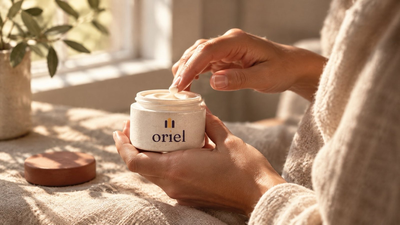
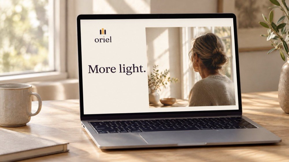
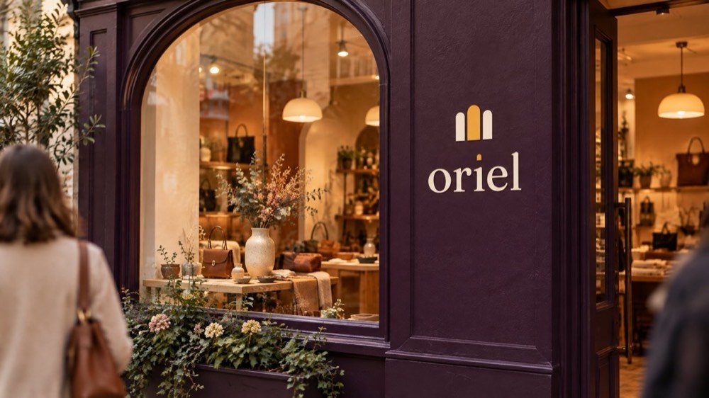
Oriel is a fictional brand we created to show our complete process. The market research is real; no client, results or testimonials are implied. Scenes like the one above are concept applications of the final logo files, not photographs of real placements.
The brief
Positioning before pixels.
For women whose skin is changing through perimenopause and menopause, Oriel is the dermatologist-formulated skincare line that explains what is happening and treats it with clinical care, because every formula is tested on women aged 45–60.
Tagline: More light.
The idea
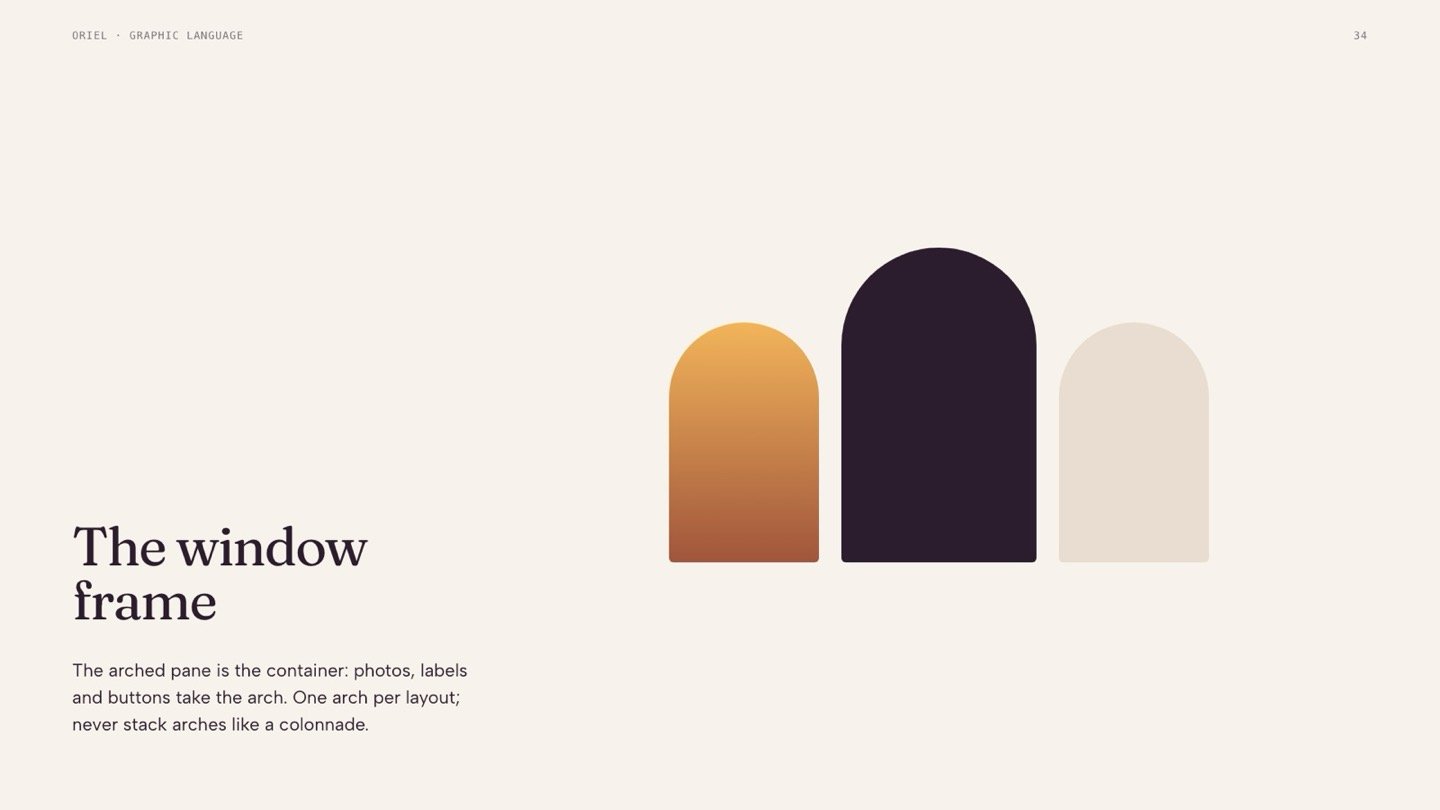
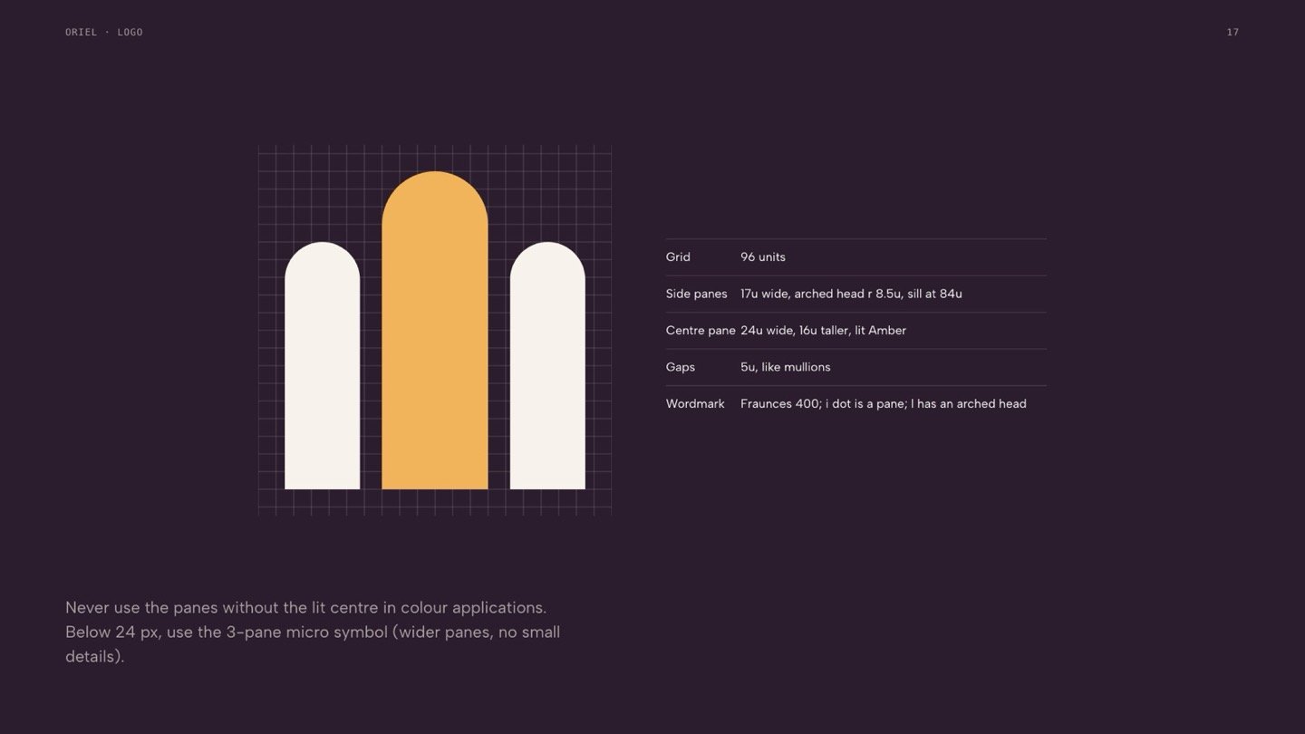
An oriel is a bay window that lets in more light. Oriel brings more light, and more clarity, to menopause skin.
Creative directions
3 directions, one choice.
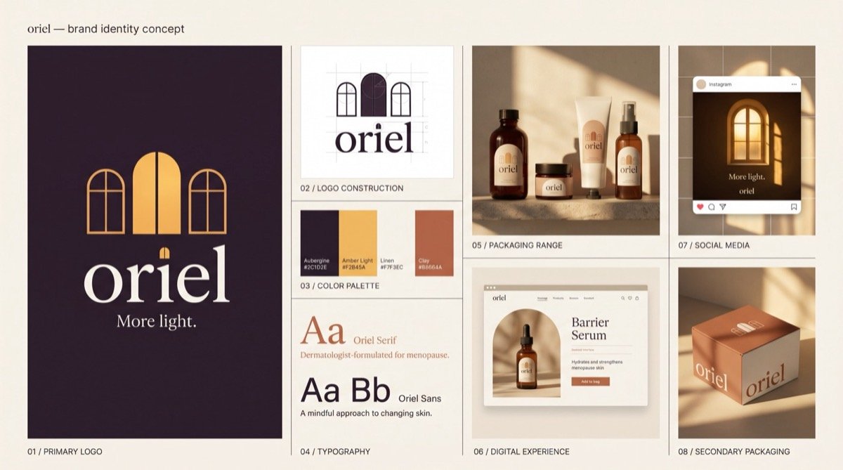
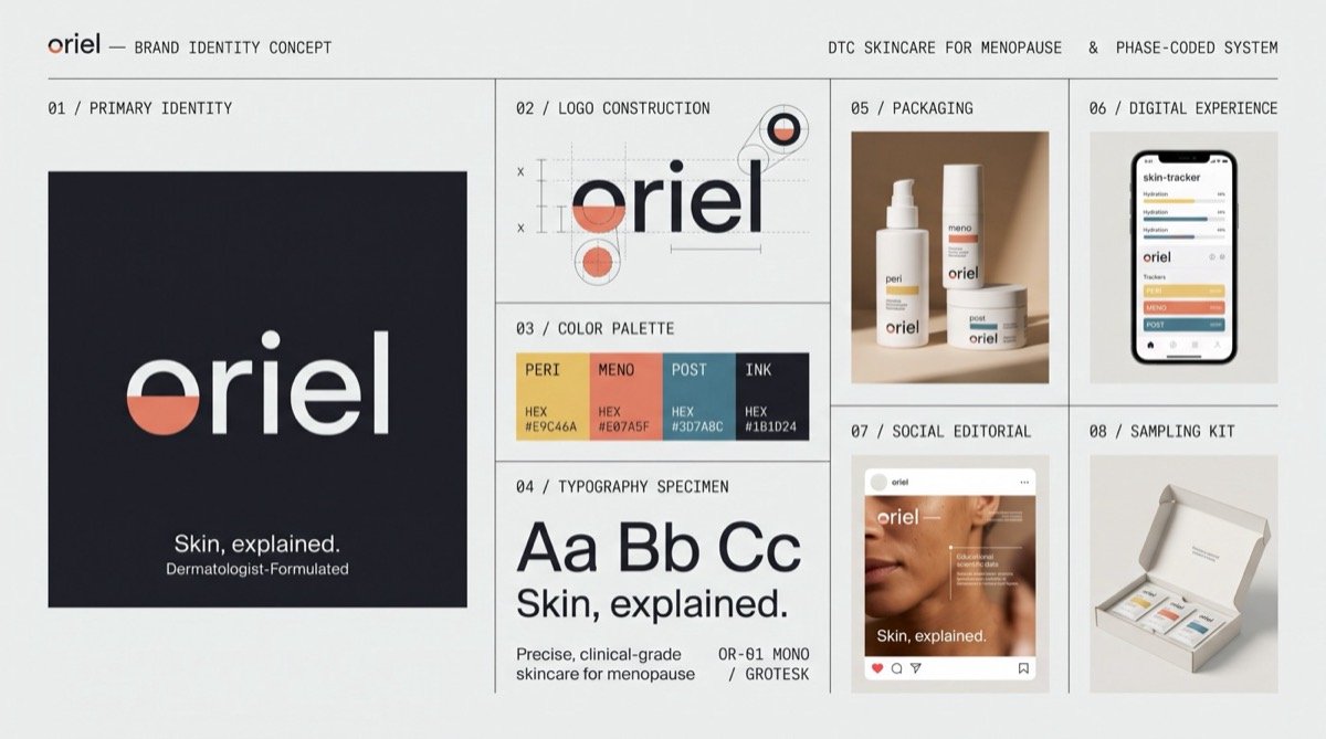
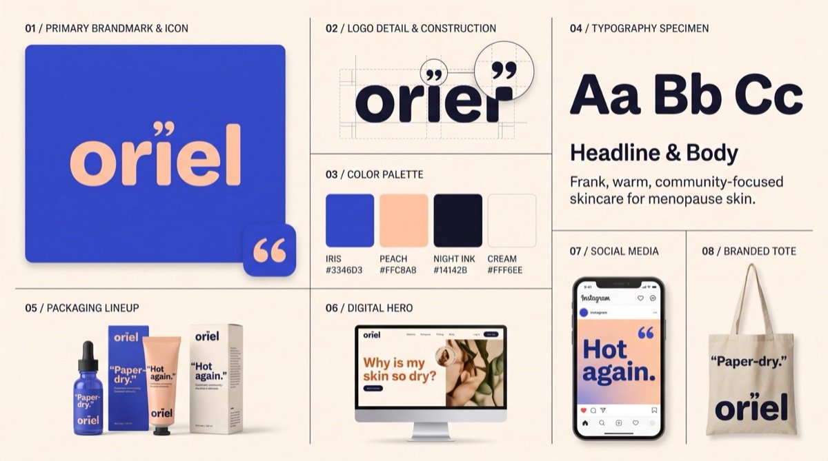
After research and strategy, we explored 3 distinct directions as concept boards. The chosen direction was then redrawn by hand as a precise vector system.
Logo system
A mark built to work at every size.



Colour and type
A palette and type system with clear roles.
Colour
Typography
Fraunces
Display and headlines
Albert Sans
Text and interface


Specification
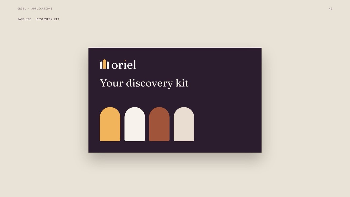
Applications, specified to the detail.
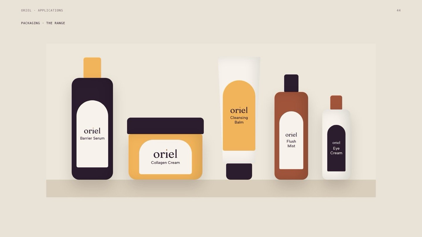
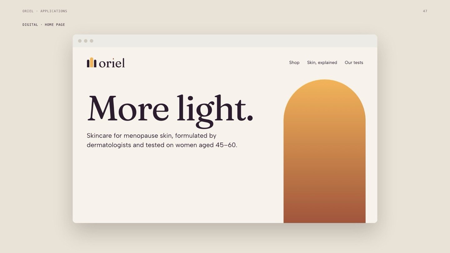
Every application in the brand book is built from the real logo files, colours and type, so the team can produce it exactly.



Brand in the world
Where the brand lives.
Concept applications made with the final logo files, showing the system at full scale.









- Research, positioning and tagline
- 3 creative directions presented as concept boards
- Logo system: 15 vector files, colourways, app icon and favicon set
- Colour palette with accessibility checks, and a typography hierarchy
- Graphic language and 12 specified applications
- 20 brand-in-the-world concept scenes
- 83-page brand book and a handoff package with design tokens